Culture, Art, Website, Brand, Design System
Jewish Museum
Frankfurt
In 2018 the 200 year old Jewish Museum in Frankfurt (Europe's oldest Jewish museum) started a major renovation of its premises and brand. A new logo was developed and it was my job to take that logo and develop a fitting website with a colour and icon system that could also be used offline, i.e. in print and museum signage.
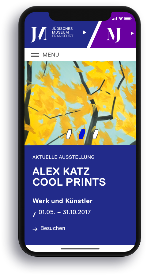
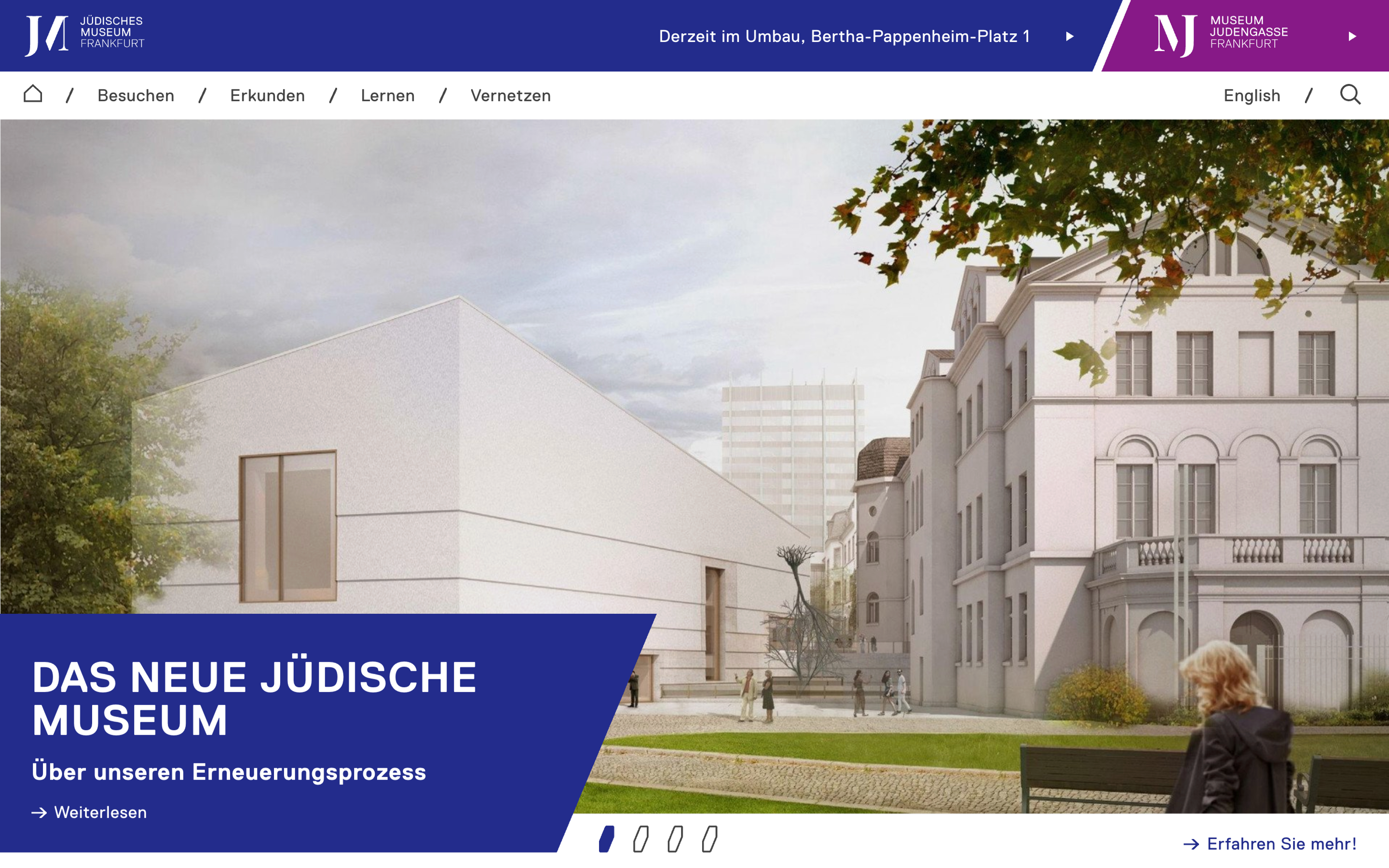
The biggest challenge associated with this job was not the multi-format assignment but the fact that the museum operates across two locations which in the past has always lead to visitor confusion. To remedy this I created a colour guidence system as well as a sliding navigation concept that prioritized one location over the other to help users orient themselves while navigating the website's content.


God is in the details.
When approaching icon design I always try to find an anchor around which to orient the form of each symbol. In this case the beautiful incisions and angles of the neo grotesque typeface ’Replica‘ served as the basis for my icon set. Helping me create a harmonious, fitting and dynamic iconography.
As mentioned above the icons were not only intended for the website but were also later extended to work within the museum's signage and print communication.

A pretty place to hang a picture
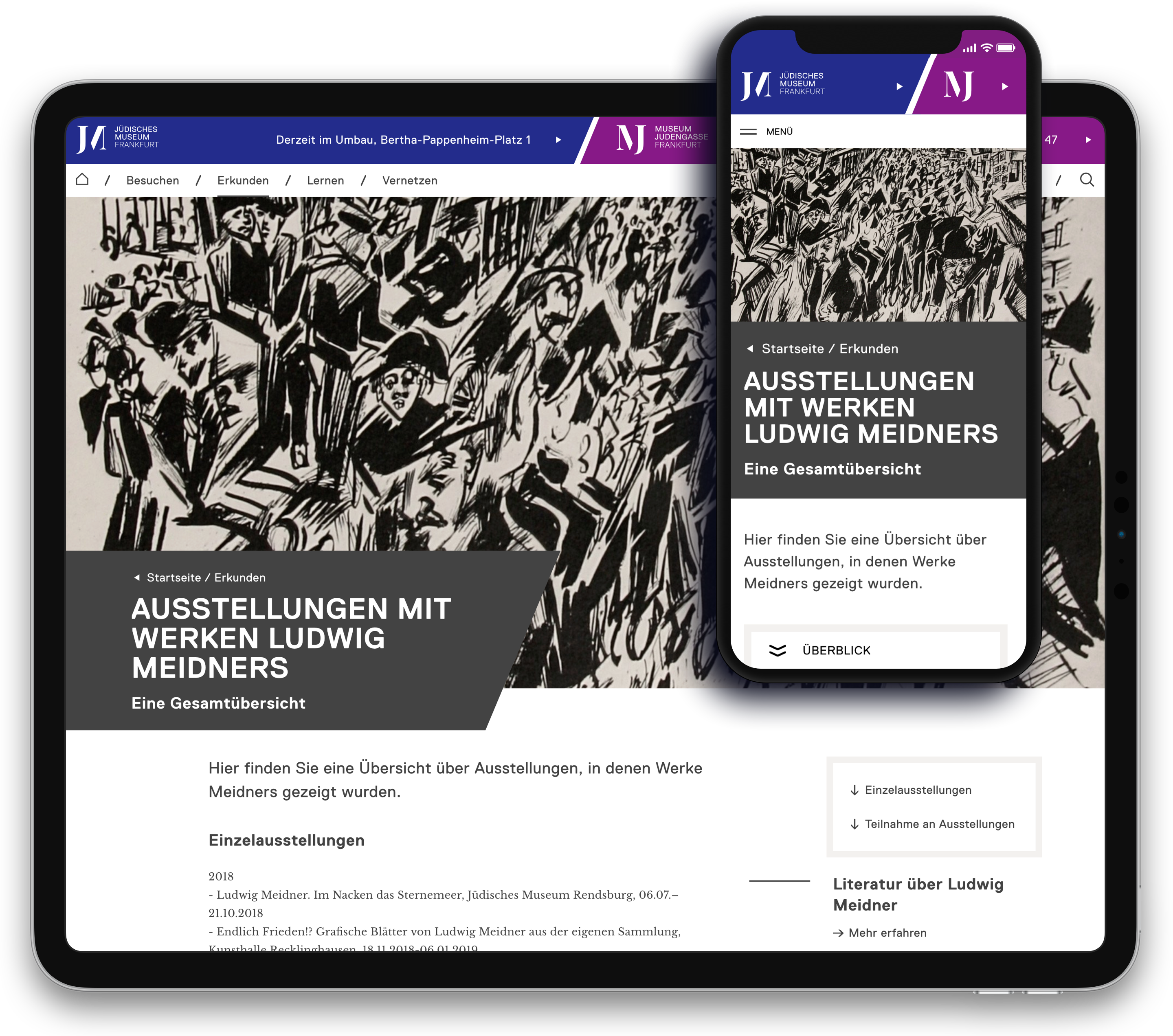
With such a diverse collection of art and artefacts the site needed to be as flexible and as accommodating as possible. Allowing the cultural collectanea room to breathe was my main aim and as such great pains were taken to make (as Albert Einstein once said) “everything as simple as possible, but not simpler”. Extensive use of white space and large modular image components were used to present the works in their best light and allow maximal visual impact and structural flexibility.

Selected Works
Birkenstock 1774eCommerce

Signals of HopeEvent
Ligne RosetEvent
Merck CosmeticsBranding

Hamburg Active CityLifestyle
BurmesterWeb

HiltiWeb
